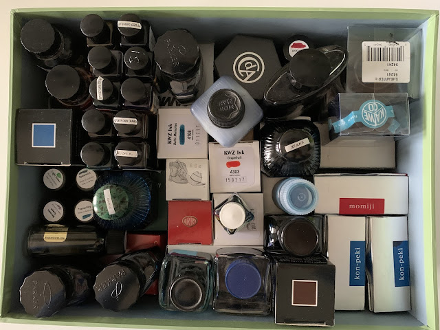
The basics of my setup (3) - inks
I've used fountain pens since my school days and, although there have been times in which my Parker Vectors or Waterman Kulturs gathered dust, I have never really put them to one side permanently. So when I first took a deep dive back in, and fountain pens became a hobby and not merely a tool, I sort of suspected the range of instruments out there could be much, much broader than I'd been exposed to.
Inks, however, were a complete surprise.
I'd never even considered that there would be such a breadth of colours produced, let alone used, so when I stumbled across Stephen Brown casually mentioning his pen was inked with something called "Noodler's Dragon's Napalm" it was hard not be hooked. And so like all newbies I bought too much ink too quickly, building up any sensible assessment of a lifetime's supply in about a year or so.
And then, thankfully, I stopped.
It turns out I'm not especially an ink person. Inks add a wonderful additional dimension to the pleasure of using fountain pens, but I'm not especially interested in them for their own sake. Inks that look good on a swatch but are illegible from a pen are not for me. Equally, I don't have a huge amount of patience with super-sheeners that take an age to dry or shimmer inks that might clog up feeds. As a result it's been a couple of years since I've bought any new bottles, and so I have had no exposure to the Vintas and Taccias and Colorverses of this world, and the ink bubble has continued to expand without me.
When the ink buble bursts, I fear an awful mess...
Thankfully, I've ended up with a reasonable spread of colours and shades, as you can see from my "ink menu", to borrow an idea from Anthony at UK Fountain Pens. Practically, I tend to divide them into three categories - "sober" inks that are work-suitable, "striking" inks for editing, and "subtle" inks when writing for pure pleasure. What are the desirable characteristics of each? Well sober inks need to be sober, of course, which generally means dark, although some reasonably bright blue shades are fine. Striking inks need to pop and to contrast well with sober colours (so no blues). And because I'll generally be editing with finer nibs, solid colour with no shading or sheen work best.
Subtle inks are where the fun is. As long as readback isn't too overpoweringly bright or too pale to be legibile, all colours and shades are in, and indeed the more shading the merrier.
At any one time, if I have four pens inked, one will be with a sober ink, one with a striking ink and two with subtle inks, hopefully in contrasting shades.


Comments
Post a Comment