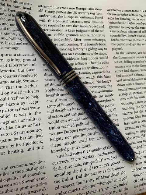
Keepers (1) - Visconti Amigdala
Most of my pens are subdued, even spare pens - black with silver or gold trim, but every collection needs something to leaven it and my Visconti Amigdala certainly does that.
My early experiences with Visconti’s lower end hadn’t been great (more about that in another post, I’m sure), but I still wanted to at least try one of their higher-end pens.
Three problems, though.
First - price. I wasn’t going to pay upwards of £500 for a pen of uncertain quality (frankly, £500 is well beyond my limit for any pen).
Second, the nib. At the time, all the quality control issues I kept hearing about Visconti centred on their palladium nibs, so I wanted to try one of their older gold nibs (they’ve since reverted to gold, apparently).
Third, the clip. I can’t stand that ‘bridge’ clip. Largely because it catches on everything and makes it harder to fit in an pen case, but also because of the laziness inherent in the name. Stick a curve on it, call it the Ponte Vecchio and maybe the fools will believe it.
Pens meeting those three requirements don’t seem to pop up that much, so when I saw this one on ebay, I jumped on it and managed to get it for less than £200.
I haven't found much information about it online. It seems to date from the early 2000s and is perhaps modeled on the early Van Goghs. It was often sold as part of set with a matching ballpoint that together were called "You and Me" - indeed "You and Me" is stamped on the back of the cap. But mine was definitely alone, coming in a box for one pen only. It's a numbered limited edition of 500 (although I don't know if that's of single pens or matching sets), and mine is number 374. Why "Amigdala"? I haven't a clue. Something to do with memory or subconscious reflexes, maybe. Or maybe just because it's Spanish for "tonsil."
The fit and finish is top notch. The blue-grey acrylic has depth and variation without being too distracting and the matte, nickel or nickel-style trim is well-executed and a good complement to it. The threads feel extremely secure. And I much prefer the more rounded form of the clip to the later bridge.
Interestingly, the clip is sprung and its tension can be adjusting using the, frankly enormous, screw on the back. I'm sure this divided opinion. But I sort of like it, in a Richard Rogers kind of way.
The section is metal - again a divisive choice. The flare helps, without being too prescriptive, but it is a bit slippy. Set against that, it tilts the balance of the pen firmly forward - something I particularly value given the way I hold my pens.


Comments
Post a Comment