Currently Inked - January 2021
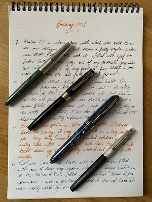
I start the month with these four pens in my Van der Spek case - with four very different nib styles. Aesthetically, I'm very attracted to the Parker 51, particularly in this cool dove grey colour with the matte Lustraloy cap. The aerometric-fillers are built like tanks too and the materials in the hand feel a considerable cut above other pens of this vintage. But, perhaps inevitably given the nib is completely hooded, it's an absolute nail so, even when filled with Graf von Faber Castell Stone Grey, I don't find it at all pleasurable to write with.
Pick up the OMAS VS the wrong way around and you might mistake it for one of many Parker 51 clones built throughout Europe in the 1950s. But the gimmick with this one is that it has a reversible nib - hooded on one side and exposed, finger-nail style, on the other. The hooded side writes stiffly, while the exposed side has some flex. Neither writes as wetly as other OMAS nibs I've encountered, but the exposed side is growing on me, and I just love the clean lines.
This Visconti Amigdala in contrast is a perfect example of the big bold open-shouldered nibs that have returned to popularity since the late 1980s. My only Visconti, this is a limited edition from the early 2000s with a wonderful two-tone 14k gold nib (from before they switched to Palladium) that shows off this slightly washed-out orange from L'Artisan Pastellier quite nicely.
Finally, an inlaid nib (or maybe simply inset) on this 1970s Waterman Concorde. Unfortunately, like nearly all medium nibs that I've encountered on Waterman pens from this era and later, it's stiff, dry and smooth - a lethal combo in my book. And it feels incredibly light and flimsy. But just look at it! One of the sleekest pens in my collection.


Comments
Post a Comment